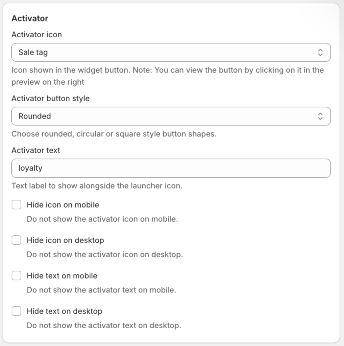
This is the main page where you can set up your store-facing Loyalty & Rewards app. The ability to fully customise the look and feel of your Loyalty & Rewards app can give your customers a more welcoming and inclusive experience when it aligns with your store branding.
Note that the widget preview on the right-hand side will show an updated version of your settings once they have been applied.
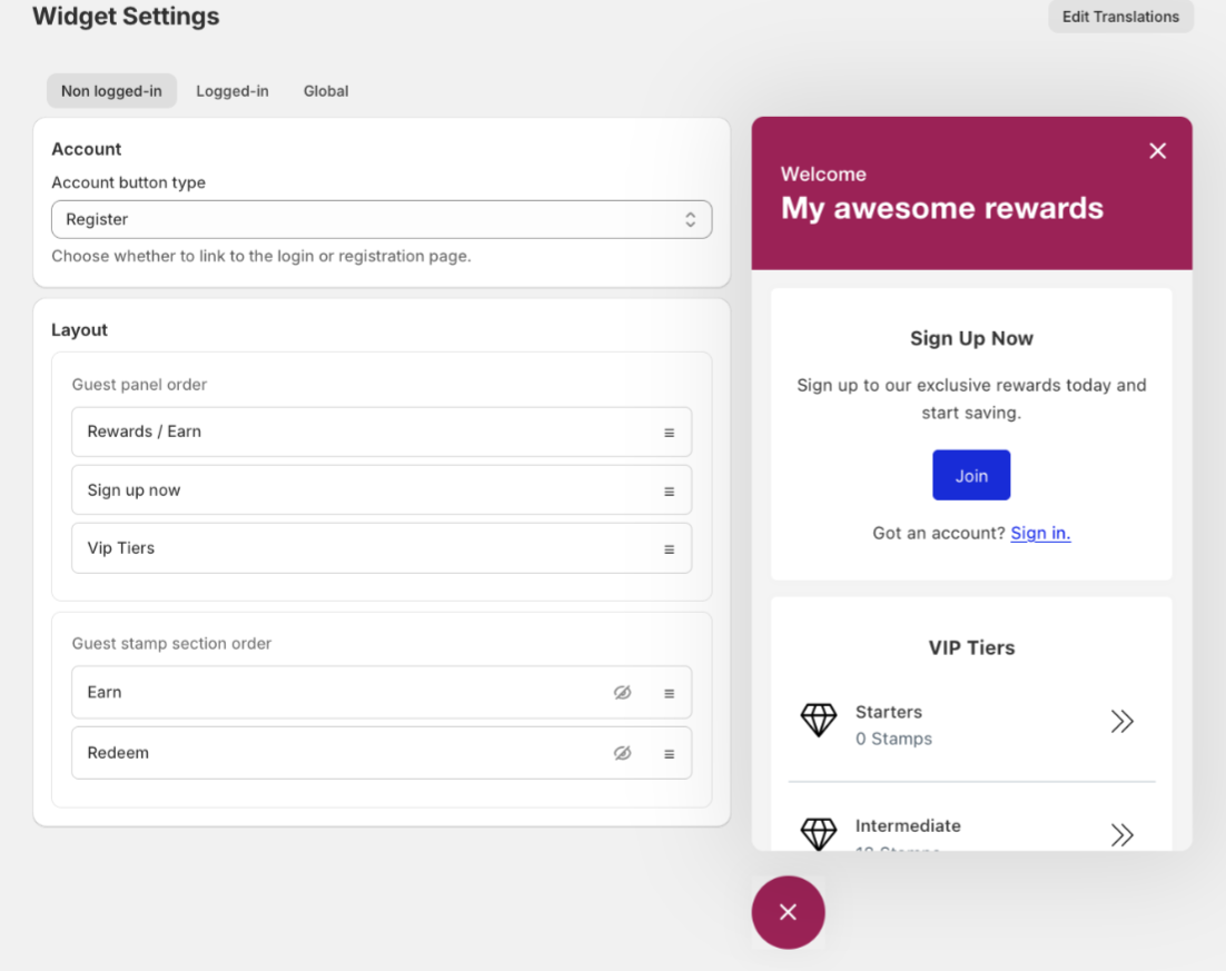
Non logged in
This is the setup for when a customer or guest visits your store and is either not logged in or not yet a member.
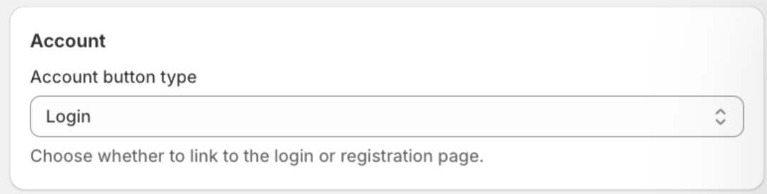
Account:
Here you can choose whether to link to the login or registration page.
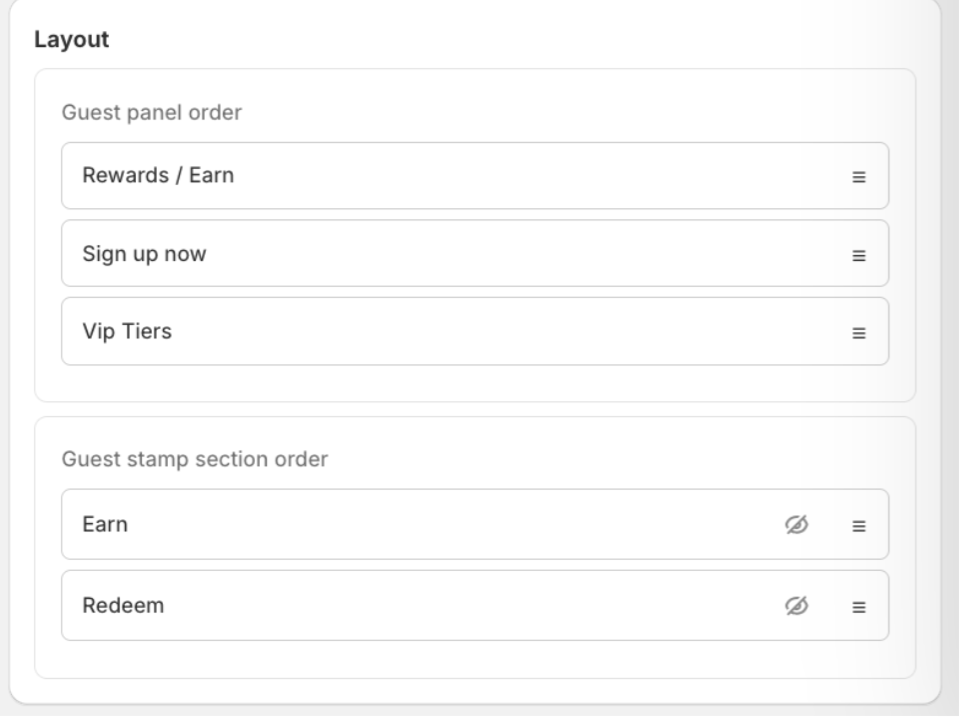
Layout:
This is where you can customise the layout and position of the categories. Simply drag the boxes up and down to the desired layout, click Save, and the widget will update.
Logged in
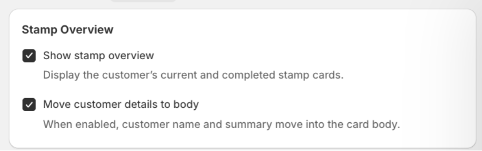
Stamp overview
This is where you can choose to:
-
Show the stamp overview (displaying the customer’s current balance)
-
Move the customer details to the body. When enabled, the customer name and summary will move into the card body.
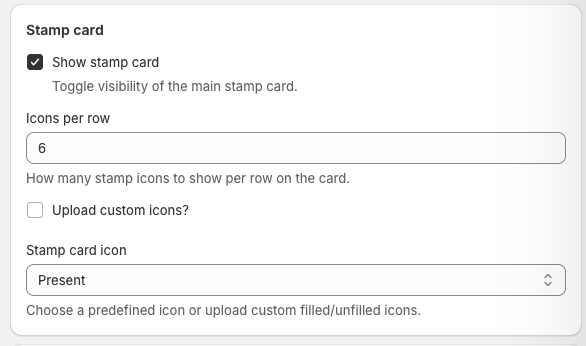
Stamp card
Here you can customise the appearance of the stamp card, including whether it appears in the widget, how many stamps are shown per row, and which icon is used. You can also upload your own custom icon by selecting Upload custom icon and uploading a file in the box that appears.
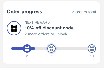
Order progress
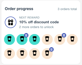
here you can choose whether you want to show the order progress in your widget if you are using order progress activity.
you can also choose between a progress bar or a stamp card
Progress bar
stamp card
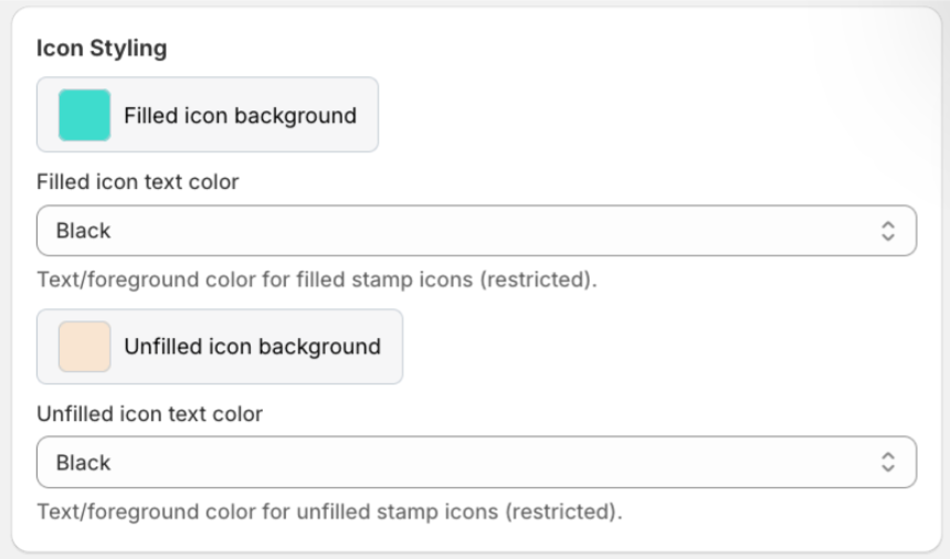
Icon styling
Here you can customise the filled icon background colour, unfilled icon background colour, and icon text colour.
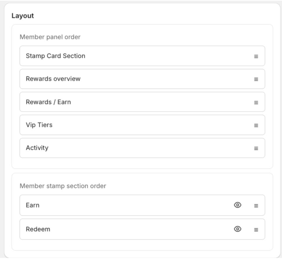
Layout
This is where you can customise the layout and position of the categories. Simply drag the boxes up and down to the desired layout, click Save, and the widget will update.
Global
The Global page is where you can adjust the overall look of the storefront Loyalty & Rewards app.
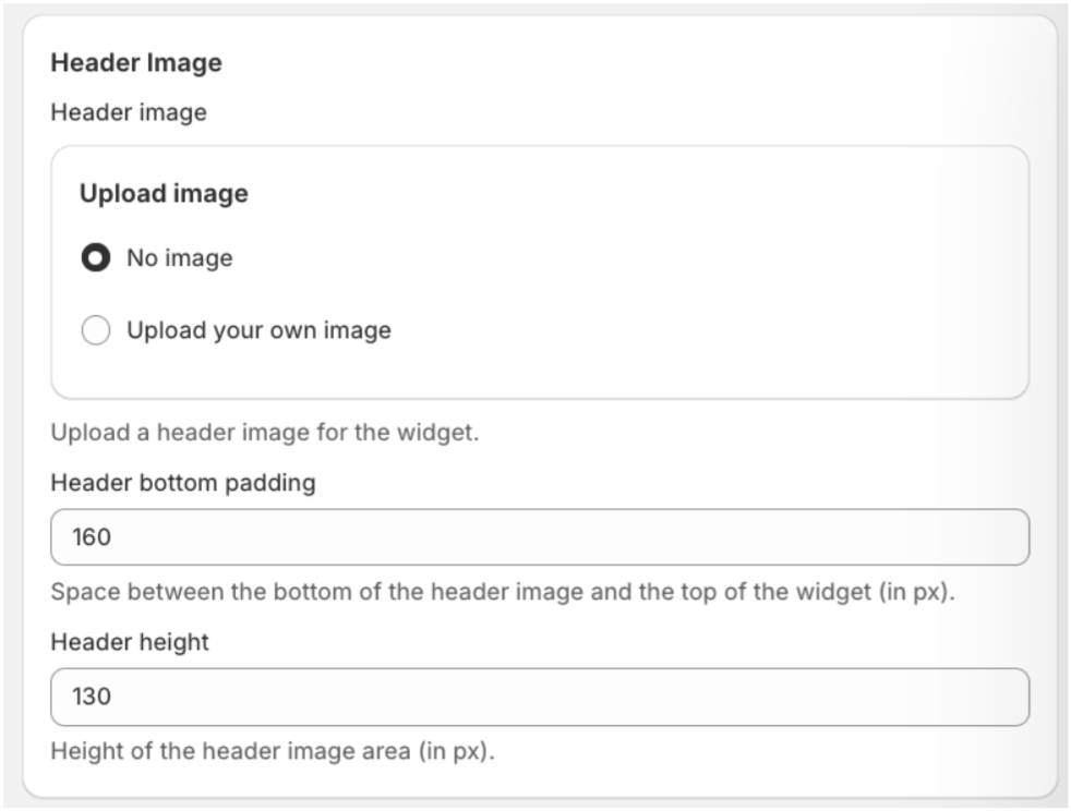
Header image
The header image appears at the top of the widget. If no image is uploaded, a colour banner will appear at the top by default.
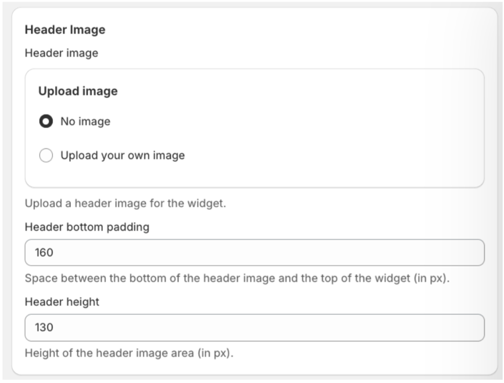
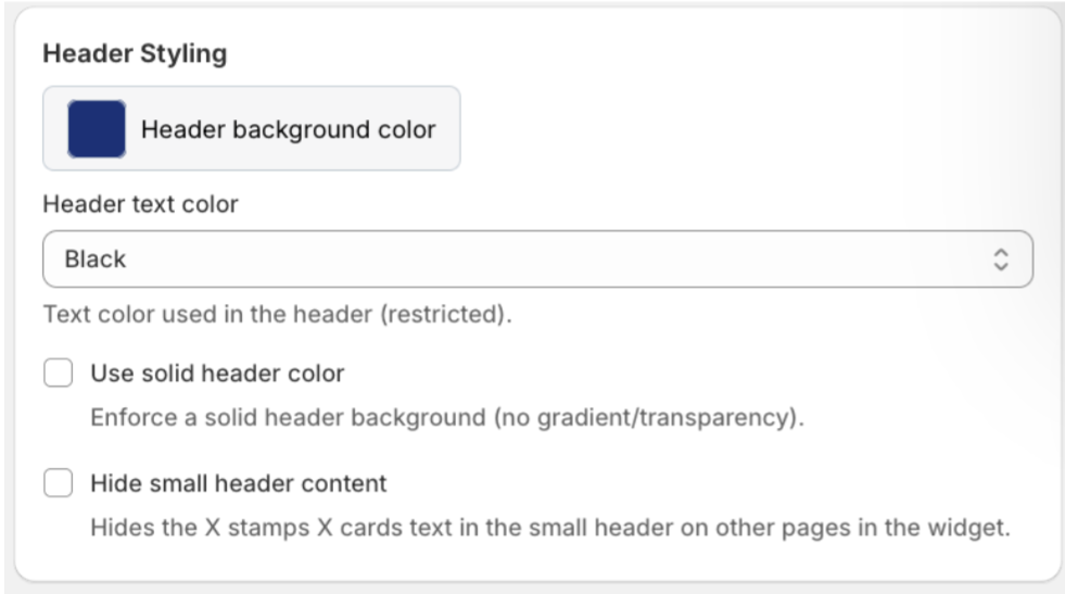
Header styling
Here you can choose the header background colour, header text colour, and whether you want a solid or graduated banner.
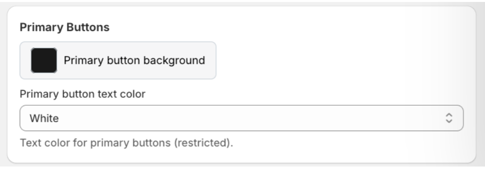
Primary buttons
This is where you choose the button background colour and button text colour.
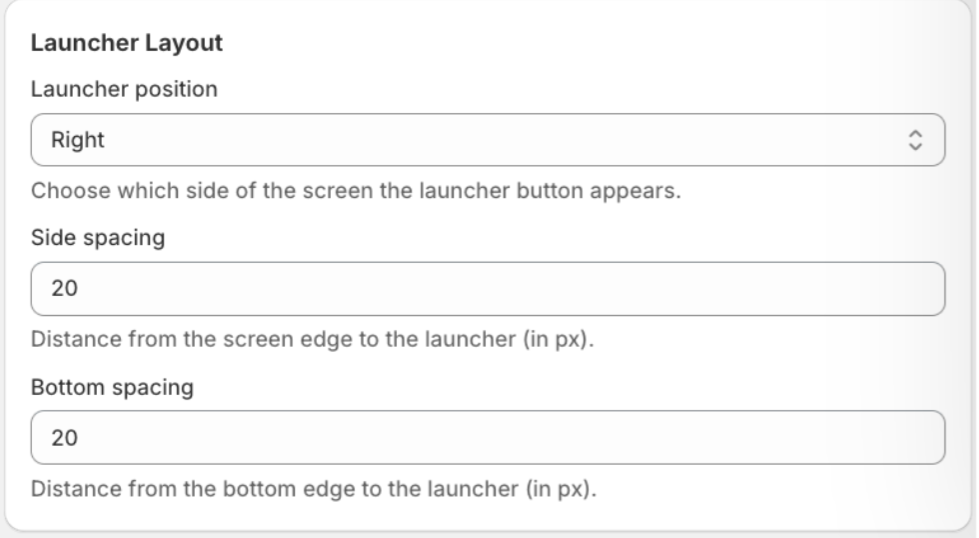
Launcher layout
This is where you choose where the widget sits on your website either on the left- or right hand side and fine-tune the side and bottom spacing.
Activator
This is where you choose how the activator button appears on your site when the widget is closed.